Showing posts with label Painting. Show all posts

Monday, May 4, 2015

Art Curriculum- Week 30- Watercolor Blue Jay- Step by Step


Week 30- Watercolor Blue Jay- Step by Step

Category: Summer

What you will need:

-big/medium/little brushes (these don't have to be specific sizes, but it was good to expose the kids to having to use different brushes to accomplish different things)
-salt
-paint palettes
-cups/bowls to hold water
-multipurpose paper

-green, red, yellow, brown, light blue (ours was called turquoise), dark blue, purple, black, paint
-hairdryer (optional to speed up the salt drying process)
Time: 1.5 hours approx. (this is a more advanced project, the kids started to get impatient towards the end so maybe plan for a break halfway through - snacks are always a safe path to go!)
Prep (was an hour because I decided to draw the bird instead of going with a coloring sheet - the reference photo is from Pinterest).

 
Project:
  • 1: Background first! BIG brush. Green paint to cover the background. Drop the colors on quickly as you can without touching the bird. Sprinkle with salt. Dry with hairdryer.
  • 2: Red berries/flowers. BIG brush. Use the side of the brush to mark the paper. Be sure to leave white spots as much as possible.
  • 2: Green. Paint the leaves, fill in the white parts with the red.
  • 4: Yellow: BIG brush. Fill in the tree. Solid yellow. (tip: always try to paint the lightest colors first!)
  • 5: Brown. MEDIUM brush. Shade the bottom of the tree trunk.
  • Light blue. MEDIUM brush. Use side of the brush the make the blots. Paint the tail solid light blue.
  • 7: Purple. MEDIUM brush. Paint top half of the birds back and try to blend with the bottom part of the bird. Paint purple on the top of the birds head.
  • 7: (continued) SMALL brush. Dark blue. Add dark blue to the light blue blotches and the top of the head. The beak is dark blue and so is the eye.
  • 7: (continued) SMALL brush. Black. Detail. Black around the eye and feathering around the face. Emphasize the importance of leaving the chest and belly white along with parts of the face.

Overall: A lengthy project filled with a lot of detail. It's worth the patience because the results are lovely! But it does take more time. Suggestions include either simplifying the picture (remove extra leaves/flowers) or inserting a break time for a snack. It depends on your kid's patience and what level they are at.


(logging 2.5 hours for prep and execution)

Sunday, March 22, 2015

Extra- Blooming Beauties (finger painting project)

tree paintings
Our projects for the month of March are all Spring/Easter themed. This is an extra project. I got this idea from a picture on Pinterest.

Category: Spring/Easter

What you will need:

-green paper
-white, light pink, dark pink paint (tempera or acrylic)
-black marker
-newspaper (to spread out on the table underneath the project)

Time 45 minutes approx

Prep: Draw or trace a tree using the black marker on the green paper.
  • Reviewed with the kids the Easter Colors we were using and the 3 parts of a shadow. There's a light tone, a middle tone, and a dark tone.

  • We used 3 colors, to avoid mixing paints I assigned each different color to a different finger.

    Pointer finger: is White, the brightest part of a shadow in shading. There's also a song called "This Little Light of Mine." This is the bright light.
    Middle finger: is the Middle Tone.
    Ring finger: is the Dark Finger.

    While we didn't use shading in this piece, if you ever wanted to do a finger painting involving shading this would be a clear and easy method to teach to the kids until they are older.
bright's wanderings
  • Finger painting the trees I let them have at it. I told them no straight lines and don't cover the hold page. Stay on or around the branches. Imagine you're painting a beautiful pink and puffy and round cloud. I showed them lots of pictures of trees in bloom so that they could see for themselves what they were trying to paint. Some of them went with Cherry Blossoms while others looked more like Apple Tree Blossoms. We did White, Light Pink, Dark Pink.

  • Then all they had to do was sign their names!

Overall: Fun. Easy. Time will depend on the level your kids are at.

Related blog posts:

-Easter Colors
-Easter Lilies (out of Egg Cartons)
-Tri Toned Cube

(logging 1 1/2 hours for prep and execution)

Wednesday, February 18, 2015

100 Days- Silhouette Painting

painting tutorial

The exciting news about today is... it is the 100th day of school! For the session of 2014-2015 we have hit the incredible one-zero-zero. The day consisted of many games with the 100 theme: Stacking 100 cups, doing 20 of 5 different exercises (5x20= 100), making a snack with 100 pieces of various ingredients, etc.

All of the above was planned and executed by me eldest sister. She also found today's art project but I had the pleasure of planning and teaching it.

To make the project extra special we bought canvases. Most of the kids have never gotten to use a canvas before so this was a big deal. :)

What you will need:

-canvases (we used 8x10)
-papertowels
-tempera paint (or acrylics - you can buy cheap .99 craft bottles)
-stencils

Time: 1 hour
  • Each child gets to pick ONE color - lay down a solid coat of that one color using papertowel
  • I then plopped white paint straight on the canvas in the center - give each child a new papertowel - have them blot/dab the white to spread it out almostttttt to the edge
  • Plop more white in the center - dab it so you have a bright center, medium pale color, then the edges are dark
  • New paper towel! I poured a little black on their paper towel and we dabbed the edges just to give it an antique border and add some contrast
  • Drying time! During this time of maybe 10-15 minutes (tempera dries fast) the kids went with my eldest sister and did some exercises while Keirstyn and I painted the edges black and blow dried the paint where it had pooled
  • When they came back they each got to pick our the stencil they wanted and we used black paint (the red and green stencils are mine and Keirstyn's paintings) - I would hold down the stencil and they would dab on the paint.
  • Enjoy and hang it on your wall!


Friday, November 21, 2014

Art Curriculum- Week 10- Pointillism

pointillism projects

Week 10- Pointillism

The past lesson was on Fauvism. To view it click here.

Artistic Movement: Pointillism

What you will need:

-tempera/craft paint
-Q-tips
-Brushes
-paint pallettes
-wood letters (I got these 1.87 a piece at Michael's, there was a variety of other options and different prices. If you don't want to go and buy the wood you can print bubble letters on construction paper have them paint them in in the same manner they paint the wood.)

Time: 45+ minutes (only because the paint has to dry, but it still dried relatively quickly)
  • Have each child pick one color. Apply the single color in a solid coat over the entirety of the letter.

  • Next pick 2 colors other than their first coat. Each child gets a Q-tip. There are 2 tips, one tip for each color.

  • Let them cover their letters with the dots in whatever pattern they wish.

  • Once they're dry they're done!
Ideas that you can use these letters for:

-Christmas ornaments
-stick them on to doors/walls/boxes for ornamentation

Overall: A fun painting project. Easy to prep for. It's a nice break from normal painting on paper. It's 3D and you can do lots of fun things with it.

Related Posts:

-Week 8- Van Gogh's Fields
-Week 7- Monet's Bridge

(logging 1 1/2 hours for shopping, prep, and execution time)

Tuesday, November 11, 2014

Art Curriculum- Week 8- Van Gogh's Fields

brights wanderings

Week 8- Van Gogh's Fields

The previous lesson involved Monet's Bridge.To view click here.

Artistic Movement: Impressionism

What you'll need:

-tempera/craft/acrylic paint (blue//light blue/white/yellow/red)
-medium sized brushes
-paper (I used white construction paper)

Time: 45 minutes

I drew a line to where I wanted the sky to come down to so that the kids would have a guide.

We used 2 different shades of blue for the sky. I had them make squiggly horizontal lines to give the sky more texture.

I gave them white and had them do a quick squiggly line at the edge of the blue.

The rest of page we painted yellow, I likened it to corn and wheat so they needed to make their lines up and down for the stalks. Then I had gave them a dark red. I allowed them one dip in the red, then they had to use only that one dip's worth of red to add to the yellow.

The birds are black paint. Either a wobbly "V" or 2 hills next to each other.

Overall: A relaxed painting project. Simple step by step.

(logging hour for prep and execution)

Monday, November 10, 2014

Art Curriculum- Week 7- Monet Bridge


Week 7- Monet Bridge

The last lesson involved making stand up pumpkin "books." To view it click here.

Artistic Movement: Impressionism

What you'll need:

-tempera/craft/acrylic paint (green/yellow/blue/purple/pink/black)
-paper (I used white construction paper)
-medium brushes

Time: 45 minutes to an hour

This is a more time consuming project. It requires more patience and step by step instruction.

I drew the bridge in pencil on each page before we began painting so that there was a reference point to use.

I started by showing them pictures of weeping willows and lily pads. I also showed them some of Monet's paintings.

I showed them how the weeping willows go "up and down" and the water and the lilly pads go "back and forth."

I started with green, then progressed to yellow with up and down strokes.

The water (blue/purple) goes back and forth. For the lilly pads I had them making little stripes of green. Then on every green little line I had them put a pink dot.

The pencil drawing of the bridge still showed through the paint and so I guided them in tracing them.

Overall: The kids handled this project very well, but it is good to have kids who've had experience in following step by step instructions and have more patience.


(logging 1 1/2 hours for prep and execution)

Tuesday, October 14, 2014

Art Curriculum- Renaissance in Review

Weeks 1-4: Renaissance in Review

This week we had a bit of a break due to sickness and Columbus Day.

So instead of a new lesson, I decided to post a quick overview of the first 4 weeks projects and how they're all Renaissance Inspired.

Last week's lesson was a Fall project (and also began the Impressionist period). To view it click here. Last week before our Fall project was when I did a quick review with the kids to see what they remembered.

I looked up pictures of Renaissance art and other cool pictures I liked that showcased the techniques we were doing. Then I would have them try and remember which project fit best with each picture.

Most of the photos I used as reference or inspiration for my projects can be found on Pinterest Board: Art Curriculum.

  • Week 1- Gridding: A project involving each child coloring in one piece of the bigger picture. I explained how you can transfer a photo's measurements and even make the image you're copying smaller or larger.

  • Week 2- 1 Point Perspective: A painting project which introduces distance and a horizon line for the kids. The Renaissance period was when art was up for being expanded upon. Things like color and texture had more of an impact on the feeling of closeness or realism.

  • Week 3- Tri Toned Cube: Painting a 3 toned cube to create a 3D feel. During the Renaissance shadows and light were paid more attention to. I showed them similar images of blocks and we reviewed the "light source." And I also showed showed how in normal portraits of people how the lighting was used to create depth in skin and hair.

  • Week 4- Self Portrait: Coloring and drawing their own clothing and features on a stick figure. I pointed out that like the kids added gardens or castles people would pose for hours with objects they valued like a favorite pet or a treasured sword. I also made of point of reminding them back then they didn't have cameras. It would take months and a lot of money to have someone paint a realistic portrait of themselves or family members.

This is a very basic overview. But some of them are quite young, and for now this is a good start. As they grow older they will cover the Renaissance in greater detail.

I hope this was helpful and you enjoy the projects!

(logging 1/2 hour)

Tuesday, September 23, 2014

Art Curriculum- Week 3- Tri Toned Cube

Week 3- Tri Toned Cube

Last week's lesson involved 1 Point Perspective. To view it click here.

Artistic Movement: Renaissance

What you'll need:
-tempera/craft paint
-printing size paper (I used copy paper, but the kind you use is up to you)

Time: 20 minutes approximately

The purpose of this lesson was to try to teach the kids about light and shadows. An early start on shading and explaining what a "light source" is.

I allowed the kids the ability to choose their own color but only offered red, blue, and yellow (I used this as an opportunity to have them recall the primary colors to me).

In the picture below you can see the gray scale picture I printed. I showed it to them and pointed out the really bright side, the extra dark side, and the in between side and tried to explain what caused the different shades of color.

What I did as a coloring sheet for the kids: I looked up Tri colored cubes and searched until I found a coloring sheet in the shape I wanted and printed off multiple copies of it.

When each child has his/her color, I had them color the top diamond on it's side.

Then I gave them each white, and helped them carefully mix the blue and the white to create a lighter hue.

In a similar manner I gave them black to achieve the darker shade. They only need a tiny dab of black.

Overall: This was a very easy project to prep and took very little time. The kids (depending on the age group) will probably need help figuring out which portion of the cube is left or right. :)

-Creating an Art Curriculum

(logging 1/2 hour for prep and execution)

Monday, February 10, 2014

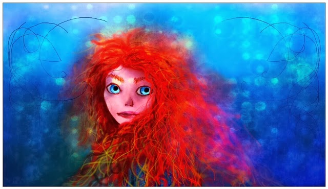
Merida- Digital Painting


Playing with one of the art programs I downloaded on my tablet. I used the free SketchBook app for tablets.

3 basic layers.
4 hours

Things I experimented with:
Opacity
Color mixing
Symmetry tool
Brushes
Blending
Skin tones
Setting a background color and building up

After I painted it I edited the photo using Pixlr Express to give it the dreamy, glowing quality.

Tuesday, January 14, 2014

Sherlock Tribute

This month has seen the return of one of the most eloquent and dramatic TV shows- BBC's Sherlock.

Already all 3 episodes of season 3 have been released in the UK and the first episode is set to release in the US this Friday.

Any Sherlock fan knows that this is a BIG deal since it's been 2 years since one of the greatest cliff hangers ever was dropped at the end of season 2.

The Game is On.

I did a rather abstract painting and then edited it using quotes from the first 2 seasons.


Wednesday, August 28, 2013

Resounding

Today I present a painting. :) This one more or less burst out screaming with me trying to bring it out with random strokes. I wanted there to be a sense of power and fury in this piece.

There is so much I can see in this piece... It was one of those "just make it up and go with whatever comes out."

Oh the possibilities of what stories could spring from this... I would love to hear your thoughts on this piece.

The third pic is an example of what happens after I complete a drawing or a painting, I like to play around on my photo apps and see what comes out of my experimenting.

Sunday, August 18, 2013

Hello


This piece contains lyrics from the band Evanescence's song "Hello."

It is a combination of watercolor and very thin copic markers.

Playground school bell rings again
Rain clouds come to play again
Has no one told you she's not breathing?
Hello, I'm your mind giving you someone to talk to
Hello
If I smile and don't believe
Soon I know I'll wake from this dream
Don't try to fix me, I'm not broken
Hello, I'm the lie living for you so you can hide
Don't cry
Suddenly I know I'm not sleeping
Hello, I'm still here
All that's left of yesterday


It's a beautiful song, with a slow and haunting melody. Part of what makes it so powerful is how subtle everything is, it's quiet and restrained. You have to turn up the volume a little and pause to think about what the lead singer is saying.

"Hello, I'm your mind giving you someone to talk to,"

I listened to it repeatedly and each time I heard new things.

This is a somewhat unusual piece for me, but I loved experimenting with the washed out streaks and diluting the black paint to achieve a bleak effect. The copic markers were also an experiment concerning detail that I can't achieve with a paintbrush unless I were to spend hours pouring over the paper.

~Bright