Showing posts with label colorful. Show all posts

Friday, February 27, 2015

Art Curriculum- Week 21- Evening Sky in Pastels

Week 21- Evening Sky in Pastels

Movement: Realism

This project is more time consuming, probably because of the attention to detail and the step by step process that takes place. Not the best project for really young or impatient ones, but we made it work, so I definitely encourage you to try! :)

What you will need:

-blue construction paper (doesn't have to be pale, I thought that it resembled a blue I've in summer sunsets)
-white, orange, red, dark blue, and yellow chalk pastels (chalk, not oil, because oil doesn't blend as nicely in this sort of project) Tip: Regular white school chalk also works as white in place of a white pastel.

For prep I drew a basic outline of clouds and added a crescent moon. I labeled each cloud with a letter or a symbol, it proved to be very helpful when directing the kids. I also looked up pictures of sunset clouds to show them that there are 3 parts to a cloud when shading: Light/Medium/Dark. And emphasized repeatedly that that was what we were going to do with our clouds.

I couldn't get the picture clear enough so I went in and used symbols on my keypad to mimic the drawing.
Below are a couple step by step diagrams I made to try and show the process of the shading.
  • White (Lots of it, layer it on. Try and get the kids to practice rubbing the chalk pastels on their sides vs trying to "color in" the spaces.)
  • Add orange, not quite to the edge. Blend using small circular motions with the finger until you can't see a hard edge between white and orange anymore.
  • Red. Not quite to the edge of the orange and blend. Add more red to deepen the color if necessary.
  • A hint of dark blue for shadow. It might look purple but that's ok, it'll still provide an extra layer of 3D quality to your picture. Blend!
  • Yellow! Use bright, beautiful yellow to accent all of the edges of the clouds. Like the light is behind and creating almost a silhouette effect.
  • For the moon color it white.
  • Shade the side closest to the clouds blue.
  • Shade the side facing away from the clouds with yellow.


Overall: A success! It's quite a lovely addition to our art collection and the kids did really well. Keep in mind it might stretch your patience.

I'm especially proud of this project because I created it myself from scratch. Everything from mapping out the colors to creating the symbol guide in the clouds.

Observe our pretties below!


Related blog posts:

-1 Point Perspective in Watercolors
-Van Gogh's Fields

(logging 2 hours for prep and execution)

Monday, February 2, 2015

Art Curriculum- Week 17/18- Expressions in Color


Art Curriculum- Expressionism + Abstract Expressionism

Movements: Expressionism/Abstract Expressionism (who knew?!)

Last week we did 2 paintings, one on expressionism and one on abstract expressionism. We smashed 2 projects into one week because the past 8 days I've been on vacation in Italy (maybe I'll have a blog post coming about that too... *hint hint*)

Expressionism: a style of painting, music, or drama in which the artist or writer seeks to express emotional experience rather than impressions of the external world.

What you will need:

-brushes (we used the cheap foam sponge brushes)
-watercolor paints
-multimedia paper

I allowed each child to pick their own colors. A limit of three. We made our backgrounds (which we tried to give a vaguely checkered pattern), then I instructed them on making their swirly trees.

I think they all turned out beautifully.

I don't know why it refuses to post right side up!

Abstract Expressionism: a development of abstract art that originated in New York in the 1940s and 1950s and aimed at subjective emotional expression with particular emphasis on the creative spontaneous act (e.g., action painting). Leading figures were Jackson Pollock and Willem de Kooning.

(See how I emphasized spontaneous there?)
What you will need:

-tempera paints
-multipurpose paper
-brushes (any kind/any sizes)
-a timer (optional)

This one was a challenge for the kids! We always focus on making the smooth and tidy strokes, planning and gliding along. This required the kids to be spontaneous and limited how much they could do.

This one is fast, so you could do multiple pieces and experiment in different ways.

First you plop 2-3 colors on every child's paper in random splotches or patterns. Because they each have their favorite color they pick EVERY SINGLE TIME I deliberately gave them colors they never use or don't like! That already made them uneasy.

We gave them 30 seconds.

That was too long, a lot of the kids work turned to mush. I suggest (depending on your age group) 10-15 seconds.

Finished trial of the first.


The second time everyone got the same colors. And we didn't time it, instead we went one brush stroke at a time. For the younger ones this was a bit difficult and they required a lot of guidance. Each child could brush up/down/diagonal/big/small. But they could ONLY do one stroke.

It was interesting to watch.


The finished results of the second trial.


Overall: Both projects were quick and fun. However if your kids are younger, they could find it challenging. Abstract art is hard to grasp.

Related blog posts:

-Cubism Portraits
-Watercolor Winter Scene

(logging 2 1/2 hours for prep and execution of both projects)

Monday, September 15, 2014

Art Curriculum- Week 2- 1 Point Perspective

Reference Picture

Week 2- 1 Point Perspective

Last week's lesson involved basic gridding. If you want to view it you can click here.

This week's lesson was 1 Point Perspective.

Artistic Movement: Renaissance

The project was good practice for watercolor painting with different methods and listening to instructions.

What you'll need:
-watercolors
-plain art paper of some kind (it doesn't have to be fancy but for water colors you want paper other than regular copy paper so that the watercolors have some texture to soak into)

Time: 40 minutes approx.

The original painting (pictured above) is something I found on Pinterest. I used it as a reference and quickly drew 7 rough copies of it using a sharpie.

I kept it basic, explained how when things are far away they get smaller and smaller whereas when things are closer they get bigger. I used a paint bottle on hand and I zoomed in back and forth in front of them.

This was another piece that I did step by step with the kids. I gave them one color at a time and we moved in stripes down the page. Blue-Orange-Yellow-Purple-etc.

For the red and orange ground I had them "messily" color within the lines with red leaving wide spaces. Then I gave them the orange and had them fill in all the white spots. I wanted there to be a bit of color mixing going on without creating mud.

The road we used black paint but I had them practice using lots of water with their brushes while taking tiny dabs of paint to achieve a lighter gray.

Overall: Easy and fun project. Simple cleanup (watercolors don't stain) and the kids love painting so it was a great learning experience.

In Addition: Something you might want to point out and explain is that cooler colors (blue, deep purple, etc) make things look farther away, while warmer colors (red, yellow, etc) make things appear closer. ;)


Related Posts:

Art Curriculum- Week 1- Gridding
Creating an Art Curriculum

(logging in 1 hour for prep and execution)

Monday, February 10, 2014

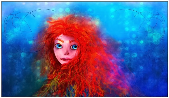
Merida- Digital Painting


Playing with one of the art programs I downloaded on my tablet. I used the free SketchBook app for tablets.

3 basic layers.
4 hours

Things I experimented with:
Opacity
Color mixing
Symmetry tool
Brushes
Blending
Skin tones
Setting a background color and building up

After I painted it I edited the photo using Pixlr Express to give it the dreamy, glowing quality.

Tuesday, January 28, 2014

Sketchbook #4

Happy Sketchy Tuesday! :)

First is what appears to be a knot. I copied it for fun from a simple step-by-step on Pinterest.


This is based off of another art piece I saw on Pinterest. :) This is a fun, simplistic piece. I edited it to give it color.


Tuesday, October 8, 2013

Sketch- magical beings

Heyloeth guys,

It's sketchy Tuesday. While watching The Hobbit (again, yes) I worked on a couple pen sketches which I colored with Prismacolor pencils.

Freehand. I used reference photos for their poses. Their arms and hands are definitely strange, but I still like these little pieces. :)

Friday, October 4, 2013

Anthem Strings- poem

acrylic painting digitally edited in Pixlr

It is time for the Thursday/Friday post!

Today is a poem. Doomsday and music smashed together.

Anthem Strings
Cut down, cut up
Gleaming paths that soon erupt
Cut up, cut down
Plucking strings that make no sound

Falling stars are silver strings
They rain down for serfs and kings
Now the basses singe the ground
They never ask the why or how

Switch lies, switch lays
Swung around within the haze
Switch lays, switch lies
Wood winds dim chaotic skies

Blow the trumpets this is our doom
Raise the harps and cloak the moon
Crush the sun by pounding drums
This is our brilliant anthem

Tuesday, October 1, 2013

Sketch- Staff/Dragons

I played with the staff... I like it better this way! :)

It's that It's that happy time of the week where I share a sketch/s. :D

Today we have a staff that was inspired by Radagast's staff as portrayed in The Hobbit. And a couple of dragons just because dragons are cool.

The surge of fantasy stuff is probably due to the new Hobbit trailer that was released today. I have no words to properly express my happiness.

ASDNWOIERHGNWOIEFNPQWWEVEVSZXCWOEIFHPIN. < That's how happy I am. :D

PS... Happy October everyone. It's now officially Autumn in the eyes of my family.

PPS... In respect to the emotionally compromised John Watson, we will do our very best to refrain from saying the word "Fall."
staff sketch in pen
dragons in pencil/concept art